Introduction
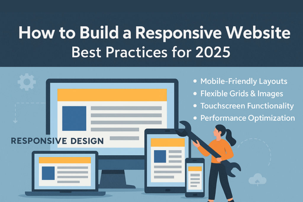
In today’s fast-paced digital era, a website is no longer just an online identity—it is the foundation of business success. With over half of global internet traffic coming from mobile devices, responsive web design has become more important than ever. In 2025, creating a responsive website is not just about making your site look good on mobile; it’s about providing a seamless experience across desktops, tablets, and smartphones, while also optimizing performance, accessibility, and user engagement.
In this guide, we’ll explore the best practices for building a responsive website in 2025, from planning to execution, with practical tips and tools to help you stay ahead of the curve.
What is a Responsive Website?
A responsive website is a site that automatically adjusts its layout, design, and functionality based on the device and screen size it’s being viewed on. Whether a visitor is on a desktop computer, tablet, or smartphone, the website maintains usability, readability, and aesthetic appeal without the need for separate versions.
Here’s a basic information table to understand responsive websites better:
| Aspect | Details |
|---|---|
| Definition | A website design approach that adapts to different screen sizes & devices. |
| Primary Goal | To ensure usability and readability across all platforms. |
| Key Benefits | Better user experience, higher SEO ranking, mobile-first compliance. |
| Core Techniques | Flexible grids, fluid layouts, media queries, mobile-first design. |
| Importance in 2025 | With rising mobile usage and AI-driven search engines, it’s essential for businesses. |
Why Responsive Design Matters in 2025
- Mobile-First Indexing by Google – Google primarily uses the mobile version of your site for indexing and ranking.
- User Expectations – Visitors expect fast, seamless experiences across devices.
- Higher Conversions – A well-optimized responsive site reduces bounce rates and improves conversions.
- Future-Proofing – New devices (foldables, smart TVs, wearables) demand adaptive designs.
Best Practices for Building a Responsive Website in 2025
1. Start with Mobile-First Design
- Design your website starting from the smallest screen size.
- Gradually enhance features for larger screens.
- Helps in ensuring speed and usability for mobile users.
2. Use Flexible Grids and Layouts
- Implement CSS Grid or Flexbox for adaptive layouts.
- Avoid fixed-width elements.
- Ensure that content flows naturally without breaking.
3. Apply Media Queries Effectively
- Use CSS media queries for different breakpoints.
- Example:
@media (max-width: 768px) { body { font-size: 14px; } } - Tailor layouts for mobile, tablet, and desktop screens.
4. Optimize Images and Media
- Use responsive image attributes (
srcsetandsizes). - Compress images with tools like TinyPNG or WebP format.
- Implement lazy loading for faster performance.
5. Prioritize Website Speed
- Minimize HTTP requests and reduce heavy scripts.
- Use a Content Delivery Network (CDN).
- Implement caching strategies for repeat visitors.
6. Ensure Touch-Friendly Design
- Buttons should be large enough for fingers.
- Avoid hover-only actions (since touchscreens lack hover states).
- Maintain proper spacing between clickable elements.
7. Use Scalable Typography
- Employ relative units like
emorrem. - Ensure readability across different screen sizes.
- Consider dark mode compatibility for accessibility.
8. Test Across Devices & Browsers
- Use tools like BrowserStack, Responsinator, or Chrome DevTools.
- Manually test on different devices to ensure real-world compatibility.
9. Focus on Accessibility (A11Y)
- Follow WCAG 2.2 guidelines for accessibility.
- Provide alternative text for images.
- Ensure proper contrast ratios for text readability.
10. Leverage WordPress Responsiveness
- Choose a responsive WordPress theme (e.g., Astra, GeneratePress, Divi).
- Use responsive plugins for sliders, galleries, and forms.
- Optimize with Elementor or Gutenberg blocks for mobile-first layouts.
Tools and Technologies for Responsive Design in 2025
- CSS Frameworks: Tailwind CSS, Bootstrap 5
- WordPress Builders: Elementor, Divi, Gutenberg
- Testing Tools: Google Mobile-Friendly Test, BrowserStack
- Optimization Tools: WP Rocket, Smush, Cloudflare CDN
- AI-Assisted Tools: ChatGPT for code snippets, Wix AI, Framer AI
Future of Responsive Web Design
As we move into 2025 and beyond, responsive web design will continue to evolve with:
- AI-driven personalization for tailored layouts.
- Voice search optimization for better accessibility.
- Foldable & wearable compatibility.
- Progressive Web Apps (PWAs) merging mobile apps with responsive sites.
Staying updated with these innovations will keep your website future-ready.
Conclusion
Building a responsive website in 2025 isn’t just about resizing images or adding breakpoints—it’s about delivering exceptional user experiences across all devices. By adopting mobile-first design, optimizing performance, and leveraging modern tools, you can ensure that your website remains competitive, SEO-friendly, and user-centered.
Remember, a responsive website isn’t just a design choice—it’s a business necessity in the digital age.

